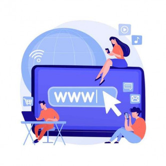
With smartphones and tablets that are becoming more widespread, making your website "responsive design" must be one of your priorities. If you haven't yet, reading the following may change your mind…
1. You will adapt your site to the new behaviors of your (future) customers
It's a fact. The French now prefer to surf on their mobiles rather than on their computers. Nearly 50.7% of us use our smartphone every day to connect to the Internet. While only 46.9% of us use our living room computer every day (Source: Mediametry, 2016). And it is clear that this supremacy of small screens will crescendo. Clearly, without being disappearing, the good old computer seems more and more neglected. Especially by the younger ones who praise smartphones and tablets at 96%.
 Good to know
It is far from the time when Internet users did 100% of their research in their living room, on the family computer… Yes, whether you like it or not, it is clear that the time is for the massive (and growing!) use of smartphones and tablets. Imagine a TV manufacturer who refused to switch to color and persisted in marketing only black and white television sets… Would he have retained his clientele? It is doubtful… Well, refusing the web responsive design is a bit the same thing…
2. You'll improve the customer experience (and your conversions!)
In practical terms, imagine that a potential customer consults your website from their mobile. If it has difficulty navigating your pages or reading your content on its screen (and for good reason, your site is not responsive web design…), chances are that it deserts your site to go surfing elsewhere. On the contrary, by offering a site that can automatically adapt to all screens (from XS to XL!), whatever the medium, you will make life much easier for your customers/prospects. And by encouraging them to spend more time on your site, you will maximize the chances that they will take action (request for information, quotes, online shopping, etc.).
3. You will also improve the natural referencing of your site
Google – which alone accounts for more than 90% of online searches in France – favours "responsive" sites. And for good reason, the most famous search engine indexing "responsive" sites more easily and quickly, the natural referencing of a "responsive" site will be greatly improved. In addition, Google brings great importance to the user experience it takes into account in its algorithm. In other words, by contributing to the comfort and satisfaction of Internet users, the "web responsive design" will improve the ranking, i.e. the positioning of your site. Conversely, a site that is not "responsive" will be penalized by Google. Which will downgrade its REFERencing…
4. You'll make your life easier
You may have heard about the possibility of keeping its website (computer version) and creating a version specific to mobile media (Smartphones and tablets). Indeed, it was the solution used before the "responsive design" technology arrived. The problem with this solution is that it involves having to manage two sites at the same time. Who says two sites, says twice as much work… And potentially content discrepancies, difficulties in updating, etc. Of course, redesigning your current site to a responsive site can be a significant cost. But this change is more of an investment than an expense. Switching to a single site will save you a lot of time and make it easier to manage over time.
 Key points to remember:
- "Web responsive design" is called a site that automatically adapts to the screens on which its content appears.
- It is a doubly beneficial technology: for the Internet user whose reading comfort is improved and for the professional who sees the administration of his site facilitated.
- Making its website "responsive design" should be seen as an investment.